BRANDING+APP |PAN AM
PANAM
REBRANDING
Reimagining the classical airline, Pan Am.
DESIGN + DVELOP + CONTENT
Michael Zhou
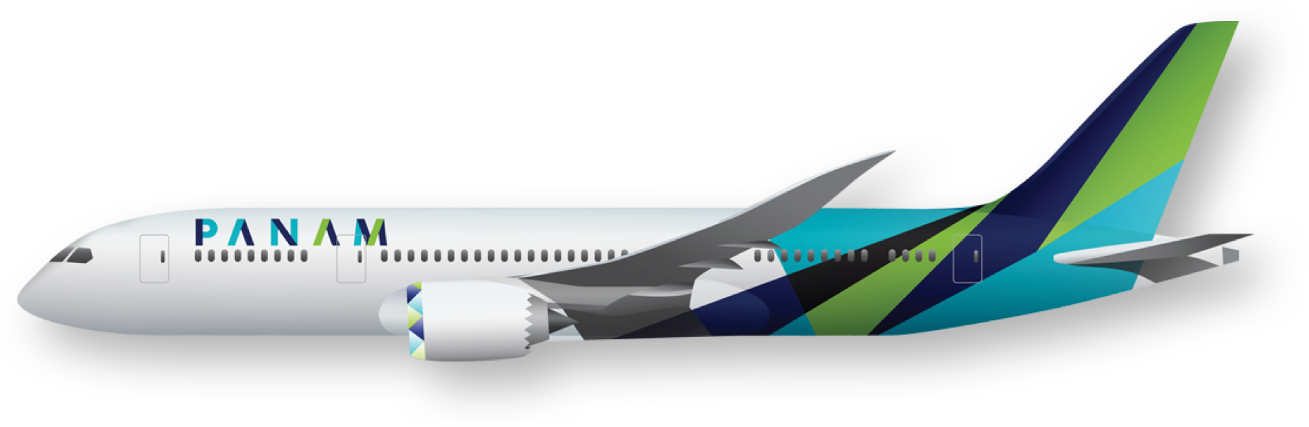
PanAm Airways went bankrupt in the 1990s, so redesigning the PanAm brand and bridging the gap between the past and the present became the main goal of this project. During the movement of globalization and the early stages of international travelling, it was crucial for an airline like PanAm to depict a globe in their logo to indicate their ability to provide international travelling services. However, today, air travel is not new to people, and even intercontinental traveling is no longer a major selling point for an airline. An increasing number of customers care more about the experience of flying and tend to have more positive reviews for environmentally friendly airlines. Therefore, during the creation of the logo and branding process, the globe aspect was discarded and I introduced the rhombus, a shape that indicates speed and movement as well as the idea of folding paper to create dynamic designs. The color pallet includes three dominant colors: light green, sky blue and dark indigo to represent eco-friendliness, the sky, and confidence. Complemented with different shades of black and drop shadows, the color pallet creates a positive and luxurious image of PanAm.


BRAND IDENTITY MANUAL
This is an identity manual for PanAm in which I outline the rules of using and implementing branding elements for future designs to maintain cohesiveness, consistency and credibility.

CLICK TO VIEW THE MANUAL.
MOBILE APP
The airline industry is gigantic and the amount of information for travelers is overwhelming. Another goal for my identity branding and app design is to present the right amount of information at the right time and location. For my app design, I introduced the idea of dynamic information display, which recognizes the time and location based on the passenger and shows the most relevant information. By creating layers and menus, I hide less relevant information to prevent confusion while leaving enough flexibility for users to get the information they need.
Flights navigation
Flights information
Navigation menu
Airport guides