BRANDING + RESTURANT GRAPHIC DESIGN
温蒂花园
WENDY’S GARDEN
A versatile branding identity for a seaside business venture in China that expresses local landscapes through a modular design.
温蒂花园 (Wendy's Garden) is a collection of businesses founded and operated by Wendy Shi, a retired entrepreneur in Ningbo, China. The two main ventures—a restaurant and a bed & breakfast—were developed around the client’s passion for gardening and flowers. Both establishments are situated in a newly developed beachfront commercial district.
During the research phase, the client emphasized two key elements she wanted the branding to communicate: the location's natural beauty, featuring a stunning seafront complex with hills as a backdrop, and her deep love for flowers.
Given the multifaceted nature of the business, I created a dynamic brand identity that adapts and evolves across different sectors of the brand and various applications.
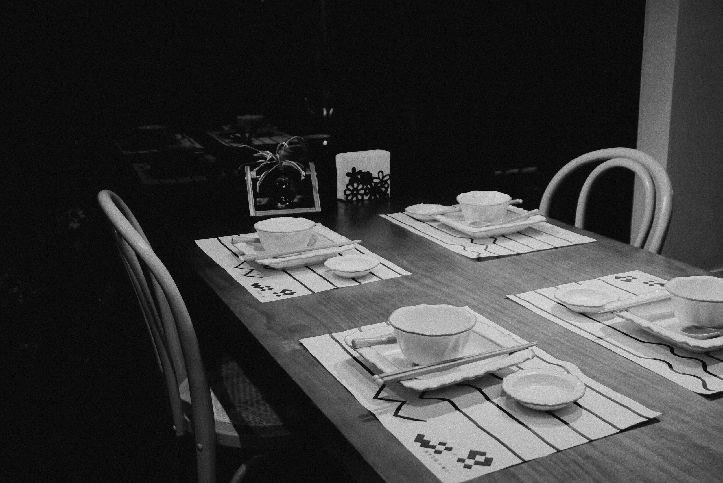
The core branding elements consist of a grid of black and white squares combined with a series of lines and curves.
The logo is constructed from these black and white squares, resembling both a pixel art flower and suggesting water waves and mountain range silhouettes. This square system extends to create other icons that integrate seamlessly within the brand. The checker pattern flows into various branding elements, such as window decals and packaging accent patterns. The design's simplicity ensures the system remains both memorable and easy to implement.


Extracted from the grid's outline, a flowing line with waves cleverly incorporates the owner's initial as a secondary branding element. The line creates contrasts and relief from blocks of color. By adjusting the corner radius, the curve can represent gentle water waves when rounded or transform into angular mountain shapes when squared and sharp.


To enhance the design system, I developed a Processing program that converts gradient maps into SVG files of gridded boxes. This adds a playful, interactive element to the design while maintaining consistency with the overall brand identity.
The W-shaped wave and line combination is integrated into the typography of this branding. The text beneath the line follows the shape of the line, indenting as it transitions into a wave. This approach highlights important text and creates a sense of movement and flow, all while maintaining the overall design style of the branding.

Doorplate

Business Card


Key Tag
Takeout bag

A single wave on the line mimics the water surface when an ice cube is dropped in.
Paper Cup


Do Not Disturb
QR Code
The choice of a black-and-white color scheme is deliberate, creating a stark contrast with the restaurant environment, which is filled with lush greenery, vibrant flowers, and natural textures. This minimalist palette not only ensures clarity and elegance but also allows the brand elements to stand out within the rich and colorful surroundings.

Way Finding

Magnet


A recent initiative with this client involves designing a monthly mini vase for displaying seasonal flowers. Each vase, approximately 13 cm tall and 3D printed with PLA, will be gifted to guests after their meals to encourage repeat visits. I designed every vase and helped set up the 3D printing equipment and workflow to provide remote support for monthly production.


